Monday, 13 June 2016

Presentation

For the first PowerPoint, a was talking about the research what I did in the research part of the course, the things I talked about was my primary research and secondary research, also talked about what poster helped me do mine on the poster.
For the second slide , I was talking about the production what software I used and website I used to make the other work to prepare for the poster and the links of the websites, in where I got my work from for example my background and logo, I was also taking about my time talking pictures of my sports drink before I did my logo, the things I talked about was the camera I used and the settings I used.

Below is the pictures of my work before I was done finishing it and using the photoshop for evidence


In the slide, i showed the poster when is was finished because in my previous presentation I didn't show my poster and my marks were reduced so in this one showed my poster to get those extra marks and to show how my work looked like when I finished after my production work was finished.
In this slide, I had to get feedback from other people what the thought of my poster and talk about the negatives and positives about the poster. I received some of the negatives, however, the majority of the feedback was filled with positive showing the poster was good.


For the final slide, i had talked about how that FMP went the things I talked about was how did you feel about the project, how you could have improved it and talk about the positives and negatives of the FMP.

Thursday, 9 June 2016

Evaluation

In my Final Major Project, I did  many things such as two posters, making two logos and making a mascot also two labels for my project. The first thing that I did was making a brainstorm of what I'm going to doing in my FMP (final major project) the things I considered doing is was making a video or making poster or taking pictures of the streets, out of those three I  choose making poster because for my a video I couldn't find any actors for me and for photograph  wasn't comfortable for me  taking pictures of streets I preferred doing the poster because I good at making Photoshop which was the main thing for making my poster so the work that I preferred  to do was graphic design.

After that I made a proposal about how I'm going to do my poster, the things what I will be included on the poster such as logo and a mascot, I also said that I will take pictures of the sports drink which I decided to make my poster about so I decided to take pictures of them. In my proposal I also said that I will make sketches of my sports drink,logo, and the mascot, I also said that how I will make my graphic design work. After that I made an initial  research and brainstorm what I did were I chose pictures of the poster about sports drink which will inspire me to make my poster, I chose four of my favorite sports drink poster and I explained the positives and negatives of the poster also explained how it will help me in my poster, I also add the brainstorm because I wanted to add it in the research so I can explain how I'm going to do my poster. After that I did my secondary research in this I had to talk about the poster of the sports drink and how they presented it and how it will help me in my making of the poster, I chose 4 posters from the most common sports drink and explain how the poster is so common and attracts people and talked about the layout and colour scheme and how it will help me.After that I did my primary research which involved a survey monkey, the question that I asked was what the name of the sports drink, what do you want the mascot to look like, what's the favourite sports drink. The results come back and people chose the name of the sports drink to be called stardust and the majority of the people chose Lucozade favorite sports to drink also the chose the poster, the other results are they wanted the poster to have a slogan,mascot and the pictures of the sports drink, the other results were the wanted the mascot to be an animals and the animal the I chose was lion because it is the most common animal.

After I did the research part of the course, I started to do the practical said of the project first I started to make the label so I can start taking pictures of the sports drink, when I was the label the first thing a did was put a background, then add a logo, after the I thought that I could make it a bit more realistic by adding the nutritional facts before that I add an image from google images, however, it didn't look nice so I just add text and made the text colour blue and it looked much better. After I finished improving the label I decided to make other ones but with different colours the colour red,green,purple and blue which is the original colour. After I made the labels I booked the camera and for the next day so I can start taking pictures, so the next day I got the camera and the sports drink with my labels and started to take pictures before that I had to check the camera settings. The camera setting that i used for the picture where low ISO because the pictures were taken indoors and it was a sunny day so I didn't need light, I also didn't need to use the aperture because the was already light from the sun because the place where I was taken the pictures was near the window so the sun was shining near the drink and camera to the objects bright. The other settings that I used were the white balance, white balance is when you remove the unrealistic colour cast. so I select it and helped me by making the white parts of my pictures stand out. After that, I started to take the pictures 5 from the front with all of the sports drink and 5 from the back and I started to take the pictures of the sports drink with each sport drink 5 from the back and 5 from the front, all together I took 70 pictures of stardust sports drink.

After I took the pictures of the sports drink I made a contact sheet to show evidence that I took pictures of the sports drink. after that I started to make my poster using Photoshop, the first thing I was done was I chose a background from google images and edit it in Photoshop and next I add a text from dafont.com and add it in the poster with some edit by putting a background to make it smart after that I add the mascot and drinks in the correct place, then I was done after that i asked Teachers is I can improve it and the helped my by making the lion blend with the background and the sports drinks also blend in with the stars by making it into the sports drink starting big and blending with the stars and getting small. After that improvement, I was finished making the stardust poster, so the next thing I did was starting to make my poster which I decided to call nuclear. The first thing I did was start to make the label so I can take pictures of them I did the same thing that I did with stardust and add the logo text which is the name of the sports drink after I add those things I so add the nutritional information like what I did with stardust label. Next, I made more label but with different colours the colours were light blue(berry) green(tropical) and orange(original). The after that I booked the camera and started to take pictures of the sports drink with the nuclear label, I did the something what I did with stardust 5 at the front and 5 at the back with each sports drink and all of them, altogether I took 80 pictures.

After I took the pictures, I started to make the poster the first thing I did was get a background from the internet and the text from dafont.com and add them in the Photoshop where I was making my poster after I add those two, the next thing I done adding the sports drink and remove the white background after that I write the text (partnership with stardust) to make it more realistic and to links those two work together. After that I asked for improvement and the improvement were removing all of the white backgrounds and changing the colour of the background which came to good effect and made the work cleaner. After I did my two posters, I needed to make a PowerPoint present my work the things that I had to include was my secondary and primary research , brainstorm , how I did my two posters and feedback from other people. The other things that I talk about were how I did my poster step by step and the pictures of my sketches before I started making the poster and label.

if I could do the project differently the first thing I could of done was check for mistakes that I made when I was making the label or poster because I made some spelling mistakes and for the poster instead I taking the background from the internet I could have made my on background so all of my projects can be man made. The other things that I could have done differently is when I was doing the research part of the course I would of add more research rather from the poster, website and videos for example if the was a billboard I could have taken I pictures of it and explain what it is helpful and help me in the project.

for the scandal personal I think I was on track with it the only problem I had was when we did the work experience I delayed me doing my evaluation because I planned it do it around that time so I had to do it during the week we come back from half term however everything is one track because I managed to finish everything I needed to do in the project in precise time and everything is done after I have done the presentation and evaluation.

Thursday, 19 May 2016

making the nuclear poster

First the place where i will be making the poster is Photoshop, the first thing that i did in my poster was adding a background fro it the place where i got my background is google images and the images link is (http://www.todayifoundout.com/index.php/2013/12/natural-nuclear-fission-reactor-gabon-west-africa/). After i add the background i add a text of the name of the drink which is called (nuclear) and i made them by getting an image from google then combining it with the text by using the magic wand tool and selecting the font and putting it behind the background and deleting the background for the text and it should be made you can see it below of how it looks like in the blogger. The next things that i have been was trying to cut the background of the sports drink because i was taking pictures of them before making the poster, while i was making the poster i had to add the picture sports drink before that i had to remove the background by using the magic wand and the eraser tool. the next thing that i did was adding the mascot (leo the lion) in my poster becxuase i made a decsion to add the same macsot because i agreed to with the audince making the mascot an animal. The reason why i chose lion as the animals becuase it was one of the most popular animals and i was think of the the king of jungle around that time eg, the lion king and the jungle book, after that i made sure that the lion we looking at the drink becuase it needs a reason why the lion was there for example (even nice animals like the drink), that could be one of the slogan. Speaking of slogan i add that in my poster by coming up the slogan in at website called (https://www.shopify.co.uk/tools/slogan-maker) and selecting it and adding more style to the slogan text by going to dafont.com and chossing a font that will go well with the poster. After i chose a font sytle and before that slogan i add a background in the font by using the magic wand tool and selecting the fonts to remove the white background and seleting it and puting the font bakcgorund in the by swith layers and prssing the delete button and it will comine with the font. After that i add the text saying (partnership with stardust) so i can be a more realistics poster by having parnters. I later asked if i could improve the poster from the teach and he told me that i should remove the black backgorund so you can read the text and i changed the background into red  or orange so i can blend well with the nuclear sign in the middle can satnd out and be the main attarction along with the drinks. The other thing that improved on was making the sports drink more really by removing some of the wehite background by using the pen tool and only selecting the bottle not the white bakcgorund and right click and make selection and pressing ctrl c or v and the well be another layer and click on the layer, the white background will be removed and put it in the poster and everything was well improved.

Tuesday, 17 May 2016

Contact Sheet 1 & 2


In this part of the project I had to take pictures of sports drink to make my poster, to take my pictures of the sports drink, first, I had to book the camera and tripod before that I had to set up a place where it has a lighting with a white background. After I set up the place where I'm going take the pictures I booked the camera for the next day, so i took the pictures the very next day and the camera setting that i used for the picture where low ISO because the pictures were taken indoors and it was a sunny day so I didn't need light, I also didn't need to use the aperture because the was already light from the sun because the place where I was taken the pictures was near the window so the sun was shining near the drink and camera to the objects bright. The other settings that I used were the white balance, white balance is when you remove the unrealistic colour cast. so I select it and helped me by making the white parts of my pictures stand out.


The number of pictures I have taken was 80 in the nuclear sports drink and 70 pictures in the stardust sports drink. 10 with each sports drink flavours the way I did to take the pictures is by taking the pictures 5 from the back of the sports and 5 in the front of the drink.

Monday, 16 May 2016

Making the Stardust Poster

to make the poster first I chose a background from the internet and the add it to the poster when I add the pictures of the sports drink that I have taken off on Tuesday and add it to the poster, the next thing I did was make then to the correct size. After that I made a font of the word stardust by doing what I did previous to make the words in my label by getting a font from dafont.com and a background then make a new page and putting then two together and using the magic want tool of the font and removing the white background and pressing the magic wand tool on the font and putting it behind the selected background and pressing the delete. So the next thing you do is putting the font in the poster, the next thing I was done was adding the mascot in the poster and in the correct place then I was done. After I was finished I asked the teacher if I could improve my poster any way I the teacher said that I could make the poster od the stars a bit bright by using the levels and curves tools and it made the poster look better, the teacher also said the slogan was a bit dark so I made it a bit bright by using the level and curves tools and it looked better the next thing I did was the picture of the sports drink had to change place so I had any idea to make the picture a bit far way like the stars and bend so I can look similar to the stars being far away and after that improved the mascot by making it a bit dark and turning it to the other direction so it can look at the sports drink in the stars with those ideas and advice it helped me improve the poster.
links- (http://ecurrent.fit.edu/blog/panther-voices/sakhee-astronomy-astrophysics/we-are-all-made-of-stardust/)


After I printed the work I was told I could improve my work even more by making the drink from small to big add the drink each time it will go small, also I was told that I could improve my work by making the slogan more bright because some people could not see it , the other advice I was told to make the lion wich is the mascot of the drink to blend in with the stars so it can look cool.

here are some of the background I made that I made before decided to use the one from the internet I made them by first selecting the shape tool to use the stardust background, the tool that I used was custom shape tool to make the stardust and made a star shape and after that I was duplicating the shape until the is a lot of stars to cover the background. After the colour that I choose for the star is blue I chose the colour before I made the shapes by selecting the colour in the top right of photoshop. The background colour that I chose was black; I wanted to make the stars stand out and bright, after that I add font stardust across to make the poster unique and different, for the rest of the background I made I got it from the internet and made the colour and font in the middle of the poster for the same reason why I made the stardust font. the only difference I made from the original  poster to the practice poster i I made then by myself only the centre logo id from the internet, all the other things in the poster I made then by using the paint bucket and the shape tools.

Thursday, 12 May 2016

My other label Nuclear

To make the label first I had to chose a background and I chose it from the internet after the I had to measure the label so when I stick it on, after that I went to Photoshop and made a new page of paper and creating my on paper by putting the size of the paper which is the size of the label. After that the page should come off the label sized paper so the next thing to do is I added I background then add a logo of the sports drink on the left side of the paper so the next thing I did to make it more realistic is I add nutritional information next to the logo, however, it will be further back because I made I mistake when I did the stick onto the bottle when most of the writing was covered by the logo. After I done writing the nutritional information I need to make the drink a little bit cool so I add the drink flavour name in the bottom of the logo by going to (dafont.com) a choosing a font then making a new page and adding the background and font together, then using the magic wand tool on the font to remove the white background then after that I used it again on the font to select it all than putting it behind the background by putting the layer of the font underneath the background layer, so after that the highlighting of the font should still by the and then I pressed deleted and everything is gone apart from the font which should have the background as it font. The next thing I did was adding the font to the label and everything should be finished.


Logo-https://www.graphicsprings.com/start-your-logo
Orange-https://prezi.com/h6ntlgjetrfe/nuclear-energy/
Green background-http://www.wallpapersxl.com/wallpaper/1440x900/nuke-one-color-211390.html
berry nuclear background-http://www.dreamstime.com/royalty-free-stock-photo-high-resolution-background-illustration-image5320995


Making the Label

So far that how the label looks like if isn't finished yet because i have to make three more because i want the drinks to have different colors to attract people. it isn't finished yet because i want because i have make some few changes such as adding some star background and making the nutrition facts the same colour as the background. the place where i got my nutrition facts from is (http://www.eesy-ees.com/shop/other-merchandise/wuma-vitamin-energy-drink-powered-by-ees/).

Size of a sports drink label length- 20.5 cm
width of the sports drink- 8.5cm

In this week i managed to finish my label with improvement for example i got the background from the internet the link is (http://www.myfreetextures.com/35-stars-at-xmas-background-images-cards-or-christmas-wallpapers/). After i add the background i wanted it to be more real so i decided to add a nutritional information.

the tools that i used to make my label was to get the text i used the text tool and add the colour i highlighted the text and went to paint bucket and selected it and chose the blue as the colour. The other tools that i used was to make the background picture to be more bright i went to the tools were the are layers and above the tools the is which says normal i clicked on the tools and click on the thing that says multiply and selected it and the pictures went bright.

Wednesday, 4 May 2016

Secondary Research - sketch of sports drink,cartoon and logo

This is the sketch of the cartoon and I was chosen by the audience to make the mascot an animal and the animal that choose is a lion because it is a one of the most common animals. To make this lion I used the website (http://www.wikihow.com/Draw-a-Lion) which helped me to draw my lion step by step because my drawing isn't very good but using the wikihow.com is helped me draw better.

The is a logo of my sports drink called stardust I created this logo by using the website called (https://www.graphicsprings.com/start-your-logo) first to make the logo I needed a name and I called it stardust because the audience chooses the name after that I needed my picture so I choose the one with the man lifting weight to represent the sports drink, after that I add some shapes in stars because the name of the drink is stardust and it says start in the name so I wanted to add some stars in the logo in some way.


In this picture, I sketch the bottle because I wanted to know how my sports drink could look like but hasn't got the banner in the bottle but I got any idea of how my work will look like. To draw this drink I used the website (http://www.wikihow.com/Draw-a-Water-Bottle) but it could look different when I take the pictures of the sports drinks

Thursday, 28 April 2016

Primary audience research

In the results of this survey, people wanted to name the drink stardust, with 4 people saying the want be  the name to be stardust while 2 people saying the what the drink to be named light beer arrow and rumble respectively, and one wanted the drink to be named blazing. So the names of the sports drink chosen by the audience are stardust so I will make one stardust drink of the audience choosing a stardust people and another sports drink and the poster of my choosing.
In the question, I asked what do you want the cartoon to look like and the chose animal as the mascot and the drink when I make the poster. Three people chose as an animal as the cartoon to represent the drink in the poster while two people chose a human,anime look-alike and other as the mascot fro the poster. so with the most answer, the audience decided to make an animal as it the mascot for the poster.

In the next question, I asked what was the favourite sports drink and the people chose Lucozade as the favourite drink which was obese because that I name of the most popular sports drink because of the poster,website, and adverts. 7 people chose Lucozade as the favourite sports drink while 1 people chose Powerade and vitamin water as the favourite drink respectively, none chose Gatorade as the favourite. this will help me in poster because I want ass information part in the poster so I can look more of a poster.
In this question, I asked how to do want the poster to look like and people said the want the poster to have the slogan and a cartoon, 8 people said the want the poster to have a slogan and cartoon while one person said the want it to have no slogan and just cartoon. none of the people chose a poster with the slogan and no cartoon and no slogan and no cartoon. the people chose a slogan and cartoon as the layout of the poster which is how the poster will look like.

Wednesday, 27 April 2016

Research-Secondary

In the research that I have done to learn more about the sports drinks in the poster is in one of the books that I read said that on page 20 in the book design secrets advertising says a famous catchphrase which will help the advert more interesting, the famous catchphrase was "whassup" which was said that it was one of the ranked popular phrases. This will help me by making a slogan in my poster so it can be very catchy and make people remember the catchphrase so if their say that famous catchphrase the will remember the sports drinks.
Lisa Hickey (2002). Design Secrets: Advertising. Gloucester,Massachusetts: Rockport Publishers, INC. 20-23.

 In this website i the things that I learnt about in this the website was present different types of drinks the reason why I think it will help me in my poster is because if I have one drink people will see quickly and look away however if a show people more than one drink then the will look at the poster a lot longer. The other positive about is if I put more pictures of drink in my poster people will be very interested in different various of  the sports drink in my poster. This will help me by maybe considered changing my poster my look of the poster because looking at this poster change my look off to the poster because looking at the poster the style of the layout and the drink and colour of them attracted me.(https://www.lucozadesport.com/products/sport/)
in this website the positive thing about this website is the theme on the website is orange and black because I don't want to have too many colours in the poster because it will just be too childish and it will not be for the right target audience am aiming for. the other that I learnt about will looking at  this website is maybe adding more the one sports drink in the poster is because I other website and books I was looking it when the were advertising the drink the had more than one sports drink in the poster or website which is very common if you look at other magazine,books and website. So probably in one of the posters that I'm going to do is adding more sports drink pictures in my poster. (http://www.gatorade.co.uk/products)
The good things about this website are the theme of black and blue , so you can make the drinks which are the main attracts stand out. the other good things about this website if you want to make the poster/website more information then I could put the types of sports drink the names of the drink so you can make the poster more interesting. the other things good about this website is information because it is trying to advertise about the good things about the drink and when you can drink the sports drink. The things I could take from this website to my poster is probably adding the names of the drink available to get so you can make the poster more realistic.(http://www.poweradegb.com/content/go/powerade/GB/en/powerade/powerade-isotonic/)
the positive that I can take about this poster/website to my poster is adding the list of drinks available to get in the store to the poster because people can look at all the drink and be interested in the poster because they attrcated to the colours of the drink. the other things that were useful in the poster/website is in the top write the is a slogan which says "#howihustle" this shows that i has it own  meme so you can remeber the catchphrase and if yoou remeber the slogan you remeber the drink. the things i would like to my poster is having a slogan and adding more then one drink so the poster can be a bit colourful with the differetn varity of drink in the poster. (http://vitaminwater.com/products/#vitaminwater-xxx)

Survey Monkey Question

What do you want to name the sports drink?

  1. Light Beer Arrow
  2. Stardust
  3. Blazing 
  4. Rumble
How do you want the cartoon to look like?
  1. Animal
  2. Human
  3. Anime look-alike
  4. other names below
What is your favourite sports drinks?
  1. Lucozade
  2. Gatorade
  3. Powerade
  4. Vitamin Water
How do you want the poster to look like?
  1. A poster with a slogan and cartoon
  2. A poster with no slogan and cartoon
  3. A poster with a slogan and no cartoon
  4. A poster with no slogan and no cartoon

Monday, 25 April 2016

Initial Research,Brainstorm And Schedule


The poster is made from Lucozade and the helped me to do my graphic work by helping me have an idea of what my background because I'm a fun of the background with the lions and the blue colour being combined together which makes the poster more attractive.  The things that I could include in my poster that helped me in this one is the blue background with the lions and the big Lucozade drink in the middle as the centre of attention. The poster was made by Phil smith a famous art director who also done the famous poster for drinks such as Guinness , Ribena and crown royal. (http://www.philsmithartdirector.com/Lucozade-Sport-2
In this poster the people that created this poster were Matthias Bauer, Janne Sachse who are known for making the billboard posters, the parts of the poster that I going to take and use it in my own poster is the font used in this poster and so the things that I could learn from this poster if make sure that the poster and the fonts with the picture of the drink all much together with the type of theme that I'm doing in the poster. (http://www.motherlondon.com/creative/post/42)T
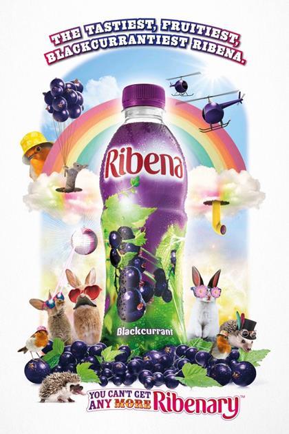
The things that I liked about this poster the making a drink like a person when the drink is running in the race showing that it's a sports drink and the other things that I like is the bright colours making the drink stand out also in the bottom right the is a logo which is good because it will be very remembered logo and I'm making my own logo for my sports drink. The ideas of the poster that I will take on board into my poster are making sure that I have my logo in my poster also having you won font which I will get from the website (dafont.com). the people who created this poster was Issam Al Bouini who is the senior art director of the Gatorade company. (http://adsoftheworld.com/media/print/gatorade_running)

The good thing about this poster is trying to aim for the target audience because the are lot of childish things such as animals and colourful colours the other things that I liked about this poster is the font is very good and has a good theme going like everything is a blackcurrant theme for example helicopter and balloon. The bad things that I didn't like about this the background colour because it was just plain white and it is very boring the could of adding a purple background because it will match the theme of purple and blackcurrant. the things I would take from this poster is making everything creative like everything blackcurrant and for my poster the theme that I'm doing a turn the picture that I made to the theme that I'm doing.(http://www.thegrocer.co.uk/buying-and-supplying/marketing/ribena-moves-away-from-health-message-in-new-ad/521599.article).I couldn't find the creators of the Ribena poster.


In the brainstorm, it's all about what I'm going to be in my FMP, for example, making my poster and how I'm going to do it in step by steps like doing the Proposal, schedule , research and evaluation, also the things that I added in this poster is the things that inspired to do my poster about the sports drinks like other sports drink poster for example Gatorade,Powerade and Lucozade. the other things that I added in the brainstorm are how I'm going to do in my project like making a logo, cartoon , slogan and banner for the poster. the other thing i add is making a name for the sports drink because I'm making two one for the audience and another with my ideas.

for my schedule i had to write about what i'm going to do for the next few weeks like for example what i'm going to do for the first week is write a brainstorm and initial research then the next coming weeks i start planing it then dong the partical part of the course. i was writing all of that i n the place called In class Activity for the independent study i had to talk about what i needed to add in my project for example if i was researching i would put in my independent study what i need to add for example links and booking a camera, it is useful because i always remember what i needed to put in my work


Wednesday, 20 April 2016

Proposal

For the final major project, I will be doing a poster of the a new drink and a cartoon as the face of the drink so when the people are having a drink they will remember the cartoon. To make this poster for the drink and making the cartoon I will use Photoshop to create my poster. By explaining this for my project I will be doing for my media piece is graphic design. For the poster, the media and website that I will use are Photoshop to make the drinks and background but for the font, I will use dafont.com and help me create a drink and cartoon I will sketch using wikihow.com as an idea of how I will make my poster.
The images that helped me to came up with the idea to make the drinking poster is the Lucozade with the one with Gareth bale as the poster boy so for one of the posters I will have my cartoon and the drink together for the other poster I will put the drink with a cheesy slogan. My poster will be similar to the Lucozade poster has a drink as it main attraction with the drink having a big image and the poster will have a cheesy slogan. For the research part of the project, I will research different sports drink so I can have an idea of what I have to do when I make my sports drink. for the audience research part, I will make the survey from survey monkey about the poster of how it will look like and the man of the sports drink I should use for the sports drinks.
My Final Piece will have to poster one with the cartoon and another with a slogan, also, I will represent my poster by making a PowerPoint about what I have been in the next few weeks. The poster will be made by first taking pictures of my sports drink with a banner of my sports drink that I will make from Photoshop and then I will probably take ten pictures then after I been the first part of the poster of the sports drink I will make another poster but I will including a cartoon that the face of the sports drink and make the cartoon using Photoshop also for the other poster I will include slogan. My work will also look like a Lucozade poster the one that I used as an inspiration but the difference that will be is I will have different background and the other thing that I will do is having a special effects in my background because the one with the lions was very good so I want to do something similar because it will look beautiful.
The things that I need to make my poster is a camera,Photoshop editing, and sketches of my work. The planning that I will need to make my poster is a schedule to check what I need to do for my project, the pre-production I will make a survey of what the want to name the beer and the colour of the background what the want and the favorite sports drink this question are for the audience because I want to make the sports drink poster for the people the people choice. after I doing my project I will make an evaluation of what I did in a couple of weeks.


  • (http://stillproductions.co.uk/portfolio/lucozade/)
  • (http://www.philsmithartdirector.com/Lucozade-Sport-2)